

LESSEN
✺ CASE STUDY / 2023
Overview
LESSEN, is a beacon of sustainability and conscious consumption in a world dominated by fast fashion and synthetic materials. Specializing in Merino wool apparel, LESSEN is more than just a clothing brand; it's a movement towards a healthier planet and an enlightened consumer base. Pete Design Co. had the honor of collaborating with LESSEN to create a brand identity that embodies their sustainability, education, and style ethos, aiming to visually communicate their commitment to luxurious, comfortable, environmentally friendly, and health-conscious fit-leisure garments.
Drawing inspiration from the natural beauty of Merino wool and the minimalist aesthetic of fit-leisure wear, we crafted a visual language that reflects LESSEN's dedication to simplicity, sustainability, and holistic well-being.
SERVICES:
Naming | Logo Design | Brand Identity
✺ Field Note 001
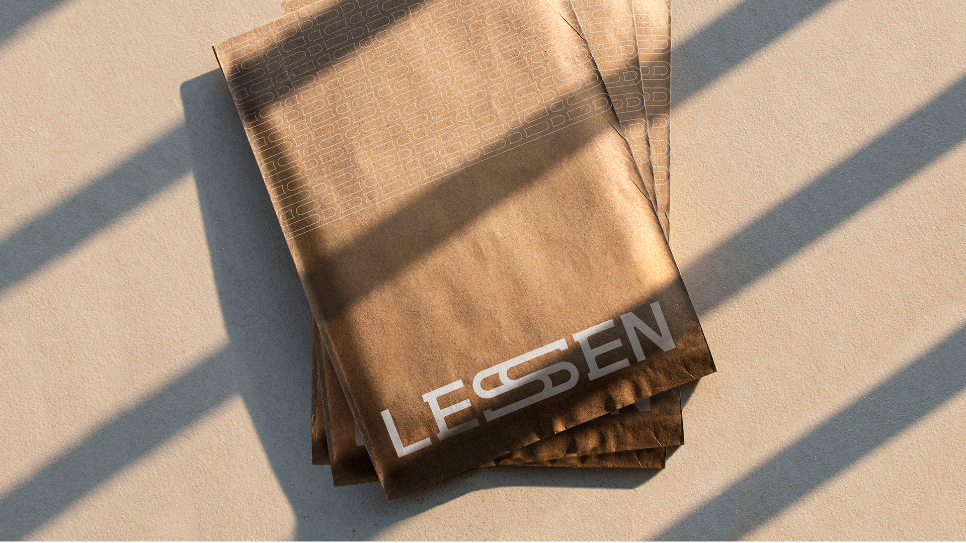
We developed a custom type-driven logo that would serve as the cornerstone of their brand identity. By crafting this typographic mark, we aimed to convey LESSEN's unique personality while reinforcing their dedication to quality and authenticity.


✺ Field Note 002
For the brand, we chose an earthy color palette inspired by the natural hues of Merino wool and the environment. These warm tones evoke a sense of comfort and coziness allowing the color palette to play a crucial role in shaping the brand perception and fostering emotional connections.

✺ Field Note 003
Part of LESSEN’S identity and name is to empower consumers to make informed choices and act as a catalyst on their journey towards a more sustainable future.


✺ Field Note 004
The name LESSEN was created to tie in the brand's commitment to educating its audience, as in “teaching a lesson” but also effectively communicate its mission of “Lessening” the amount of plastic in our clothing.


